Work
ColdSpark Media
Print Design, Digital Design
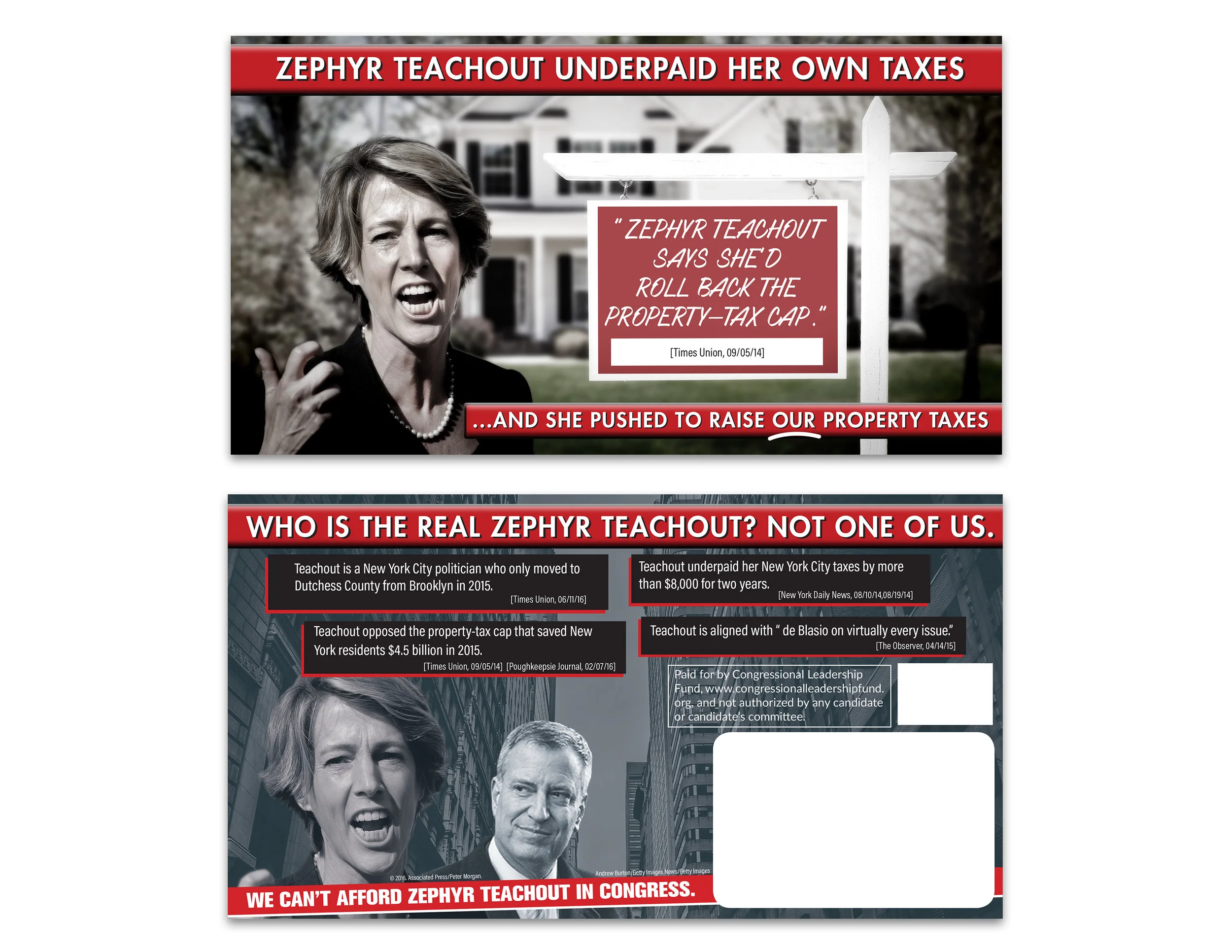
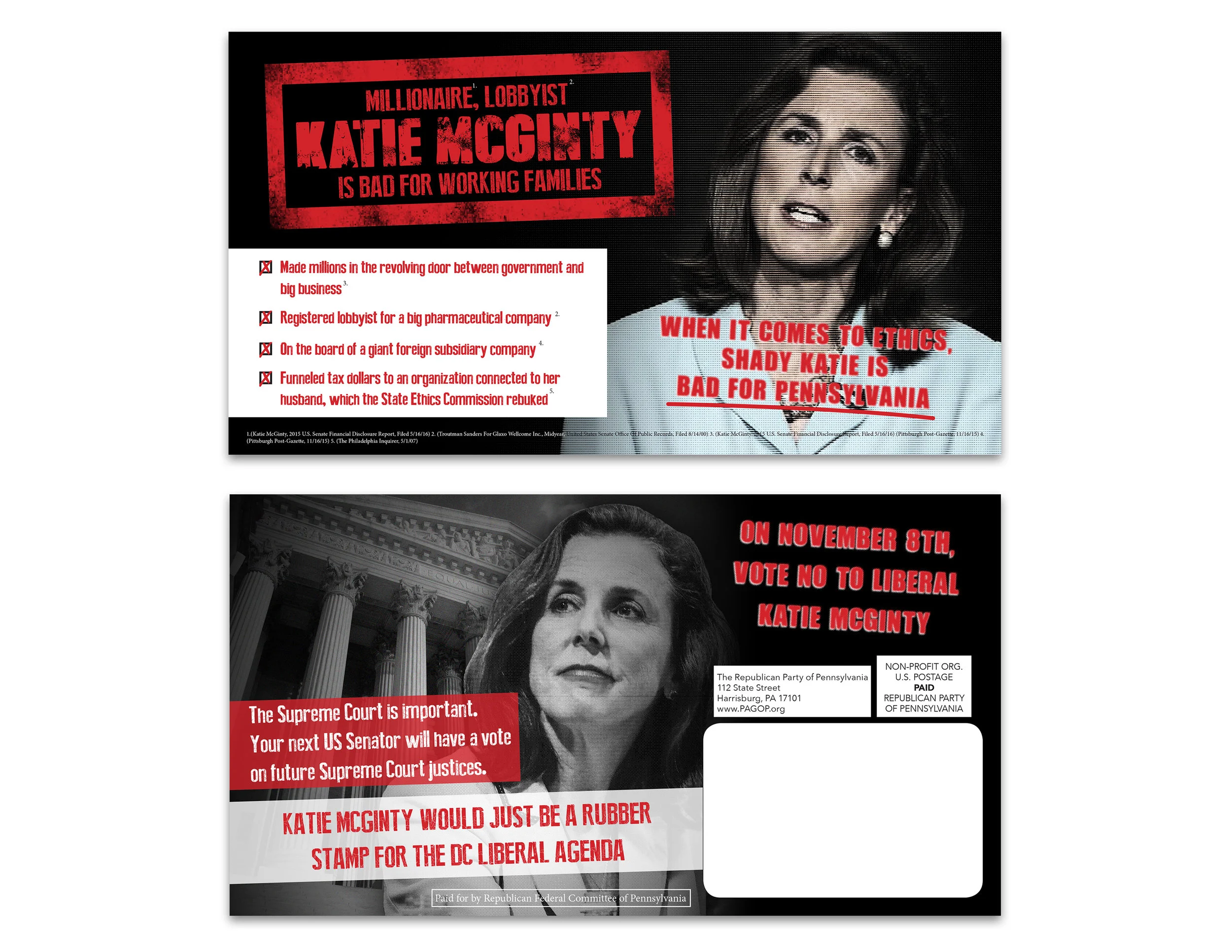
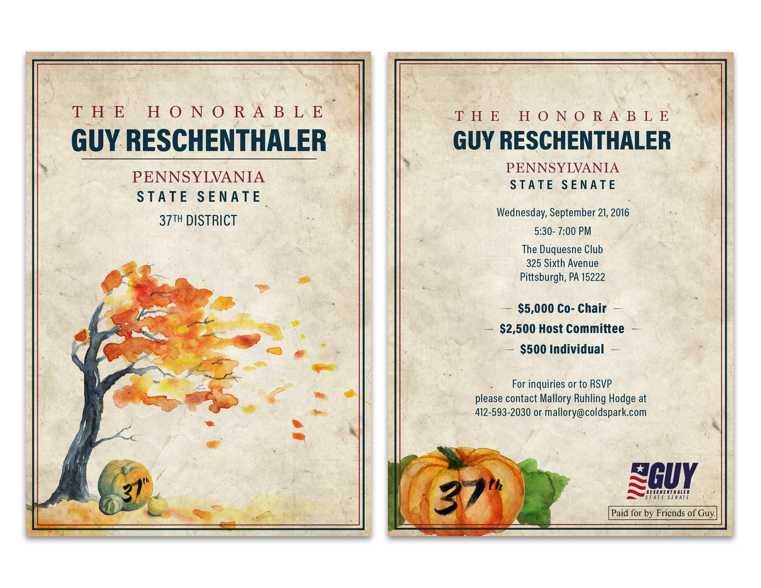
While working at Coldspark Media I got to experience the speed at which an advertising agency really works. The pace was insane along with long hours and constant edits for design work. I enjoyed the intensity of the agency and the work I was doing. Most of the work was political and it was mainly split between print and digital design work. I not being a political man myself didn't mind doing ads and mailers for senators, state reps, or congressmen and woman but was solely focused on creating a great end product. Below are just a few of many pieces I worked on for them and I must say that I wouldn't mind getting back into the agency life.


Nowait
Print Design, Digital Design, UI Design, Marketing
During my time at Nowait, an app that used host and guest seating to get guests into restaurants faster, I was introduced into the world of startups. They run at a very different pace and it definitely opened my eyes to how amazing companies like them truly function. I mainly worked on marketing projects like print designs and digital designs, but also got to venture into the UX and UI realm which enhanced my skill set greatly. I was even able to assist the company with a new rebranding which included a new logo, website, marketing materials, promotional materials, and internal materials. I am eternally thankful for the experience and also the people I met, they are what make startups so successful.


Rapper Stamp Series
Photoshop, Print Design
I have always been a lover of music and pop culture for this project I wanted to combine them both. We put a lot of emphasis on musicians and the effect they have on society, so why not put them on a stamp. I decided to do some photoshop manipulation to create this series of stamps showcasing some rappers and musicians as a set of stamps. I went with a sketch style for the actual faces of the musicians which combining custom typefaces for each stamp. In the end all I have to say is that I would collect every single one.


Wallflower Lookbook design
Layout Design, Print Design, Retail Design, Photoshop
Back at it again this boutique just keeps getting better. This time releasing a series of photos for a spring/summer collection that it contains within its brick and mortar setup. The owner wanted something clean and simple to reflect the vibe of the store and the state of the clothing. With using photos provided by Alexa Liming (owner and photographer of Wild Native Photography) I decided to go with a treatment that combines a vintage look with modern clean elements that compliment each other very well. A bold type treatment for the tag lines really brings a sense of what the store houses as far as style and culture, so needless to say keep a lookout for this rising boutique.


WallFlower Retail Branding
Branding Identity, Digital Design, Visual Design, Retail Design, Photography
This small boutique opened its doors in November of 2014 and started off with a bang. Housing women's clothing, accessories, and, certain beauty products it keeps gathering new customers with its boho vibes. This retail boutique needed a complete branding treatment along with a website plus in store signage as well. I went with a simplistic approach throughout and gave the logo type a water color vibe. The owner wanted to give a fresh perspective to her own store and really make it her own, so thats exactly what I gave her.


ShaZam App Interface Redesign
Visual Design, Interface Design, Digital Design, and App Design
Apps are a huge part of the tech revolution, a new one being developed almost everyday. The only problem is that sometimes these apps are not as user friendly or visually appealing as we would like them to be. So I decided to take an app that I use quite often, Shazam, and redesign the interface to make it a better version of the original design. I stayed with the same color scheme but went with a more flat simplistic design. This feels more modern and less cluttered than the older version. I also made the app much more user friendly and easier to navigate. I also included some of my original sketches for the redesign to show the progression of the work from start to finish.


808's & Heartbreak
Cover Art, Print, Digital, and Packaging Design
I love music and most importantly the album art that goes along with it. Something that I love is viewing the art for an upcoming album from one of my favorite artists, even before it's released in stores. Now with that being said I am a big fan of Mr. Kanye West and most of his music; my absolute favorite album is 808's & Heartbreak. This album has been at the front end of a lot of my design sessions and it will always inspire me. Therefore I wanted to create my own vision of the album art based on what the music created inside my head. Keeping my style and Kanye's attitude throughout the process, I feel as if I've achieved a great result. Music can always be inspiring so keep listening and the rest will come to you.


Jam with Jamie
Branding Identity and Advertising
At the beginning of 2014 I acquired an internship with an up and coming children's entertainment company known as Jam with Jamie. I was their only graphic design intern so I was responsible for any and all graphics that represent the company. The owner of the company contacted me to complete a total re-branding of their image; I was assigned to complete business cards, several flyers (both print and digital), a t-shirt design and many other elements for the company's image. I went with a style to resemble that of a child's drawing motif, this way kids could recognize the designs and parents could become familiar with the Jam with Jamie name. Lastly, I chose bright colors and unique images to show that the company is kid friendly and very fun for all ages.


Great Gatsby Typography Movie Campaign
Typography and Print Design
The Great Gatsby is on my top ten list of favorite books and with the release of the blockbuster hit in 2013, I knew I wanted to create a project dedicated to the major characters and quotes from the book. I went with a very classic photo treatment that gave the effect of an old vintage photograph. Also I wanted to create a strong statement with the quote and a geometric pattern since both are instrumental parts of the movie. I think the style that I have created in my artwork demonstrates true example to anyone that this movie and book are a timeless story that will impact many generations.


Modern Vintage Trading Cards
Print Design and Image editing
I haven't always been the biggest sports fan but I guess it took some time til I grew up to really appreciate it. For this project I decided to develop a series of trading cards of some of my favorite players from various sports teams. I took current photos of players and created the look of a vintage style card. My goal was to blend the old and the new that is reminiscent of the early baseball cards of the 40s and 50s. I believe this project gives a strong example of how my style can be both contemporary and vintage while delivering a message about the growth of sports culture over generations.


The Dapper Squid
Branding Identity and Print Design
Restaurants have the ability to take you away from real life for a little while or help you just relax after a long day. In my last year of college I was given the assignment to create a completely original restaurant and branding to go along with it, so naturally I ran with the idea. I wanted to create something not only with my taste and style in mind but also somewhere that I would want to go. The final result was the Dapper Squid, an upscale seafood establishment with flair that comes from black tie elegance. The Dapper Squid is my creation and with a simple color scheme and sophisticated font it is sure to turn some heads.


Anatomy Typeface
Typography Design, Vector Art, and Illustration
There has always been a part of me that has been fascinated with medicine and the anatomical form. I am pretty passionate about both art/design and medicine so I decided to create something with both points incorporated into one design. I used a base font to create each individual letter modeling it after a part of the human anatomy. Trying to keep a certain style throughout the project, intricate sketches with a modern twist, I'd say that I like the result. I won a Neographics award from the National Graphic Arts Association for this piece and wish to add more to this piece in the future.


